Watson Data Platform
Role: Visual Design, UI/UX
Tools used: Sketch, Adobe Illustrator
Watson Data Platform is an integrated set of tools and services that help companies accelerate their shift to become data-driven organizations. Our mission was to design an experience to enable data teams to discover, ingest, catalog, govern, and analyze information.
As the visual designer on the team, my main focus was integrating the existing IBM Analytics Design Language seamlessly across the Watson Data Platform. This included unifying the overall grid, colors, and iconography across all products.
User Research
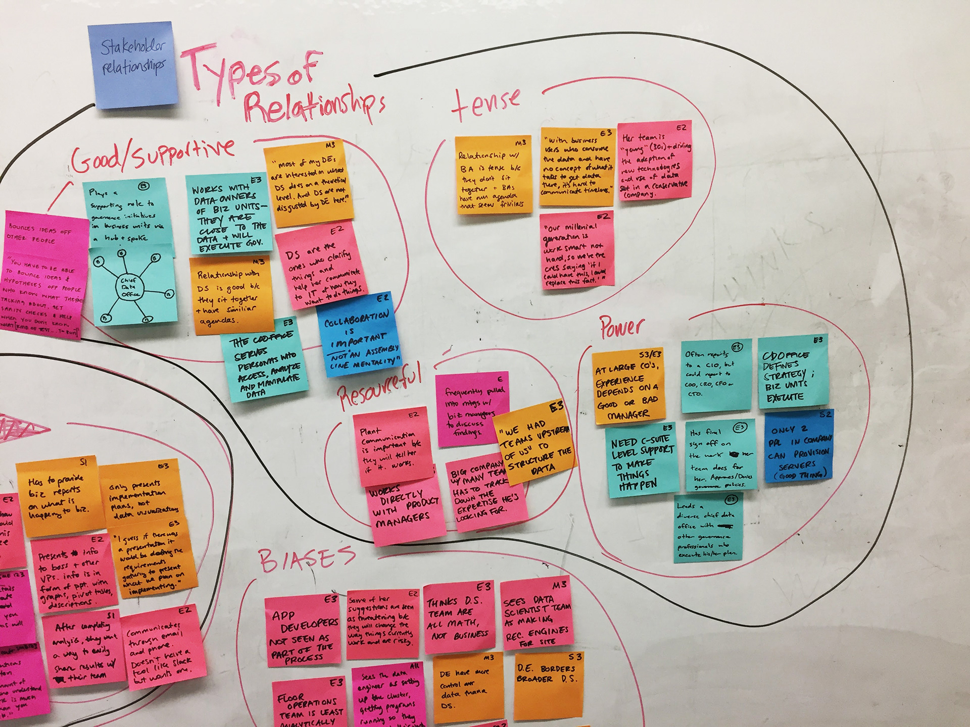
Before our first design sprint, my team and I learned as much as we could about the product and who was using it. Through this extensive research we were able to understand the user and their pain points.
PAIN POINT 1
When data is siloed, it's difficult for consumers of data to find the information they need to analyze
PAIN POINT 2
Understanding and utilizing data requires tribal knowledge
PAIN POINT 3
Understanding how to comply with governance policies is difficult for data consumers because the tools aren't made for them.
...there is nothing comparable out there which use[s] a single unified platform for the personalized roles within an organization... business analysts, data engineers, and your data scientists. All these three people who are going to deal with your data.
- IBM Sponsor User

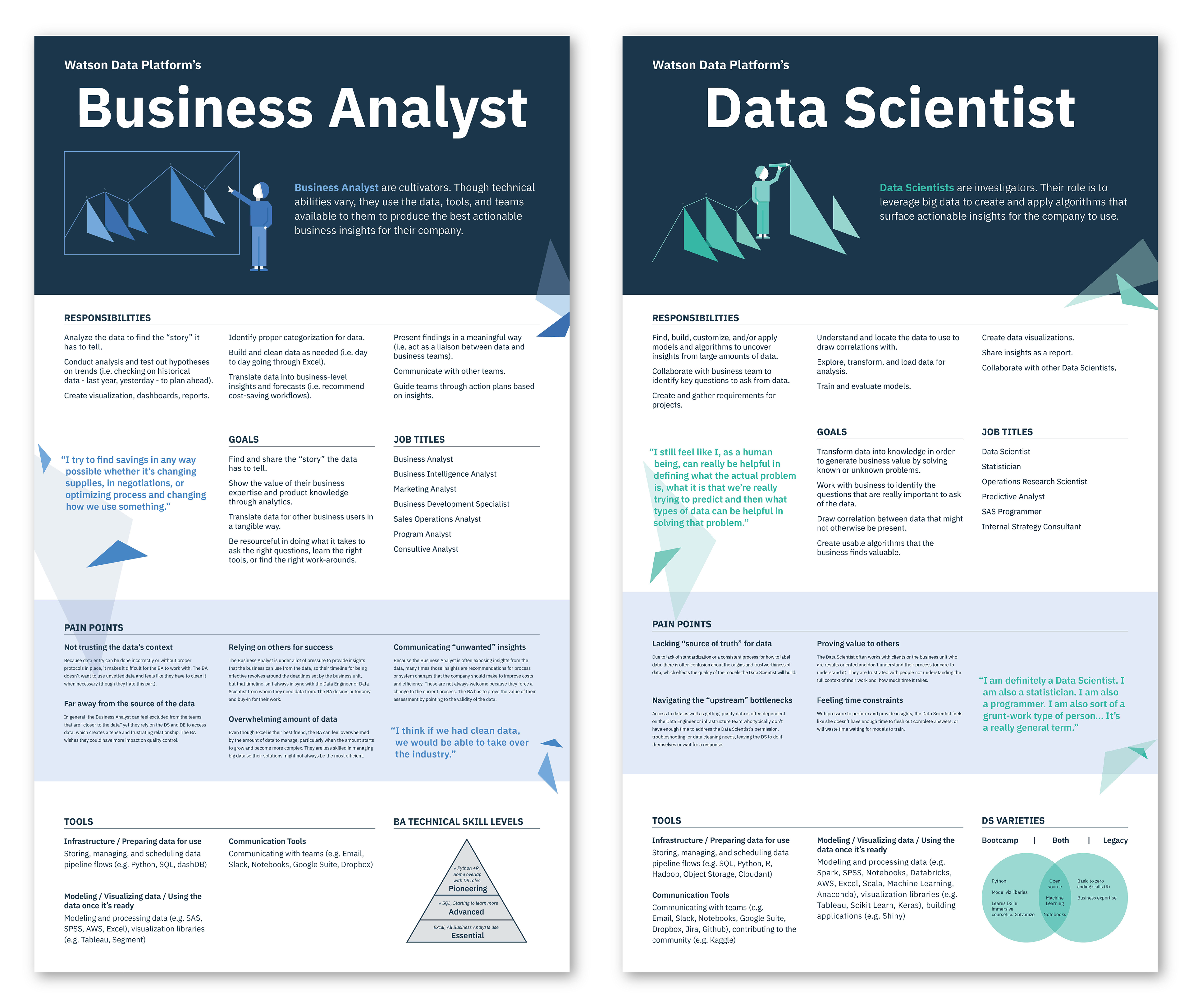
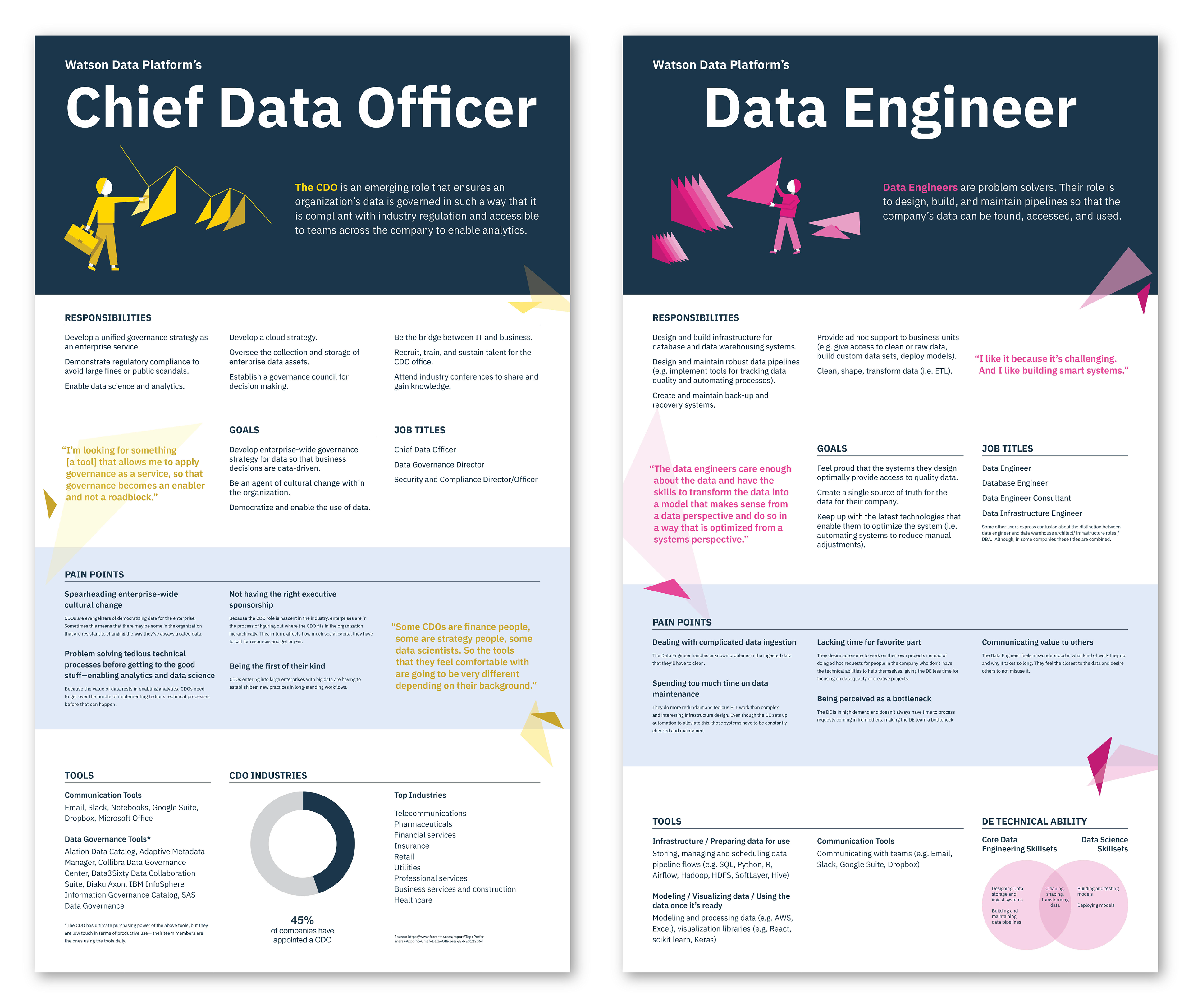
Persona Posters
Watson Data Platform provides solutions for users that work with data from storage to governance to analysts. Our users include Business Analysts, Data Scientists, Chief Data Officers, and Data Engineers.
I designed persona posters for our team space because it was important that we had our user research available at all times.
Each poster shows the responsibilities, goals, job titles, pain points, and tools of each persona along with helpful data visualizations. These posters proved to be very helpful for the team, but also became a focal point in the IBM Design Studio.
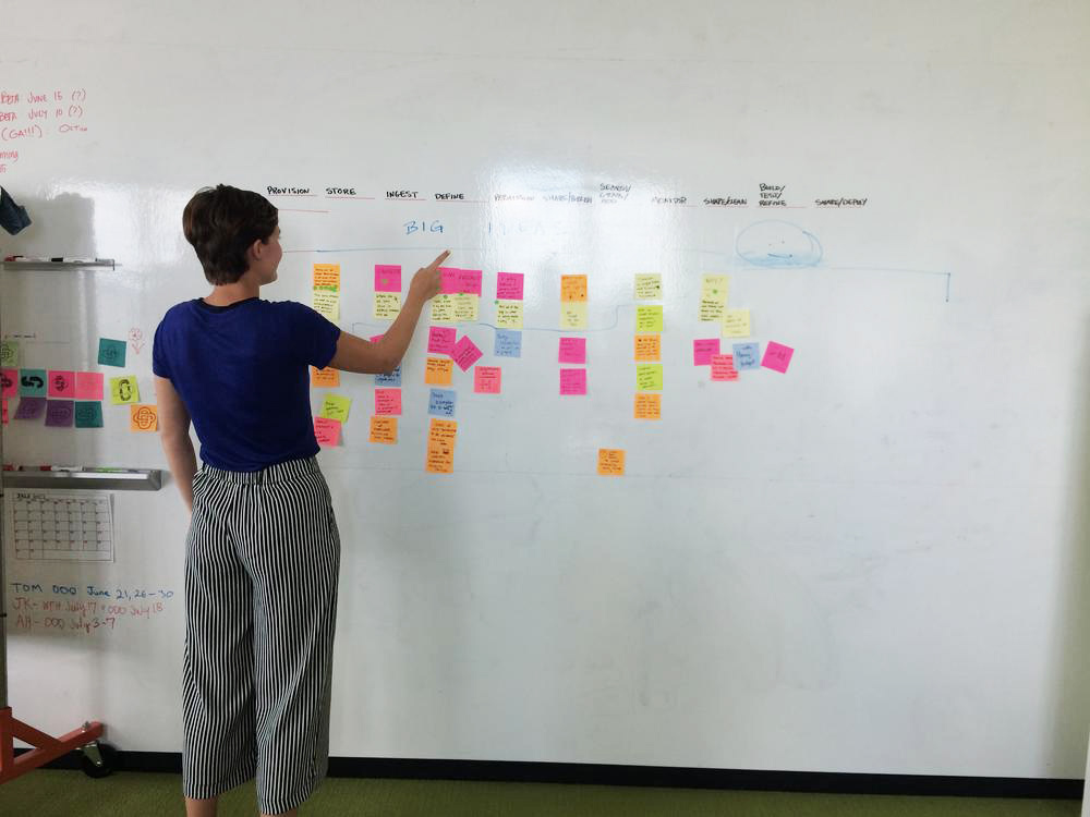
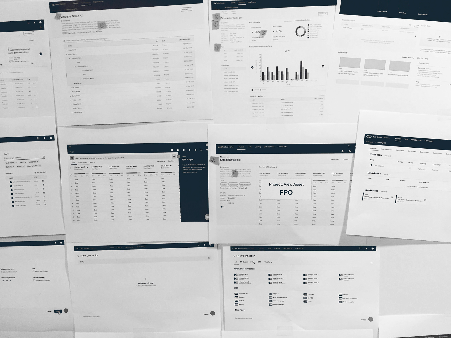
Ideation
I worked closely with our UX designer to create initial sketches and wireframes. We went through many rounds of ideation followed by playbacks with our sponsor users and other important stakeholders.
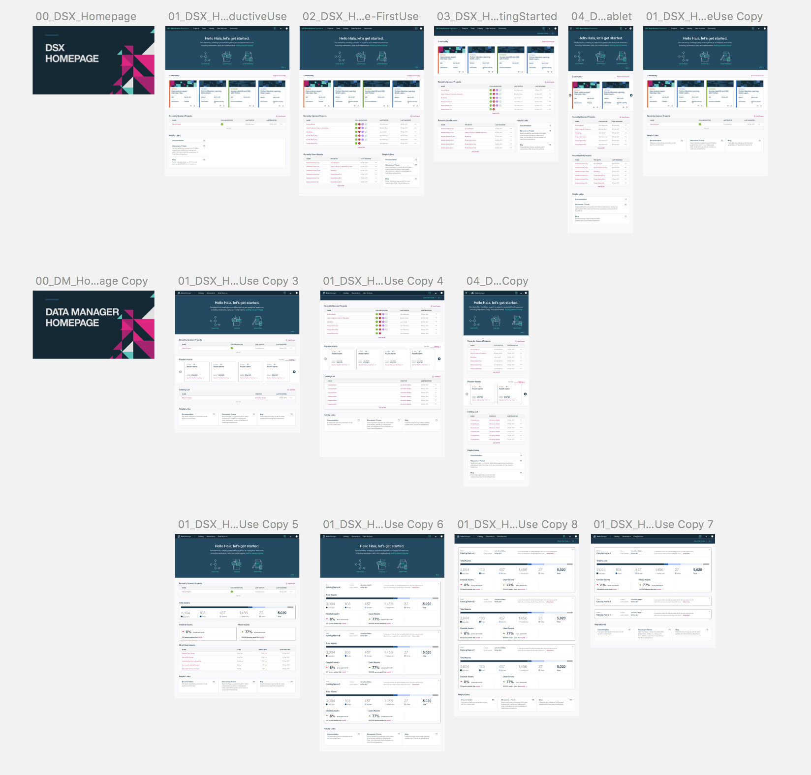
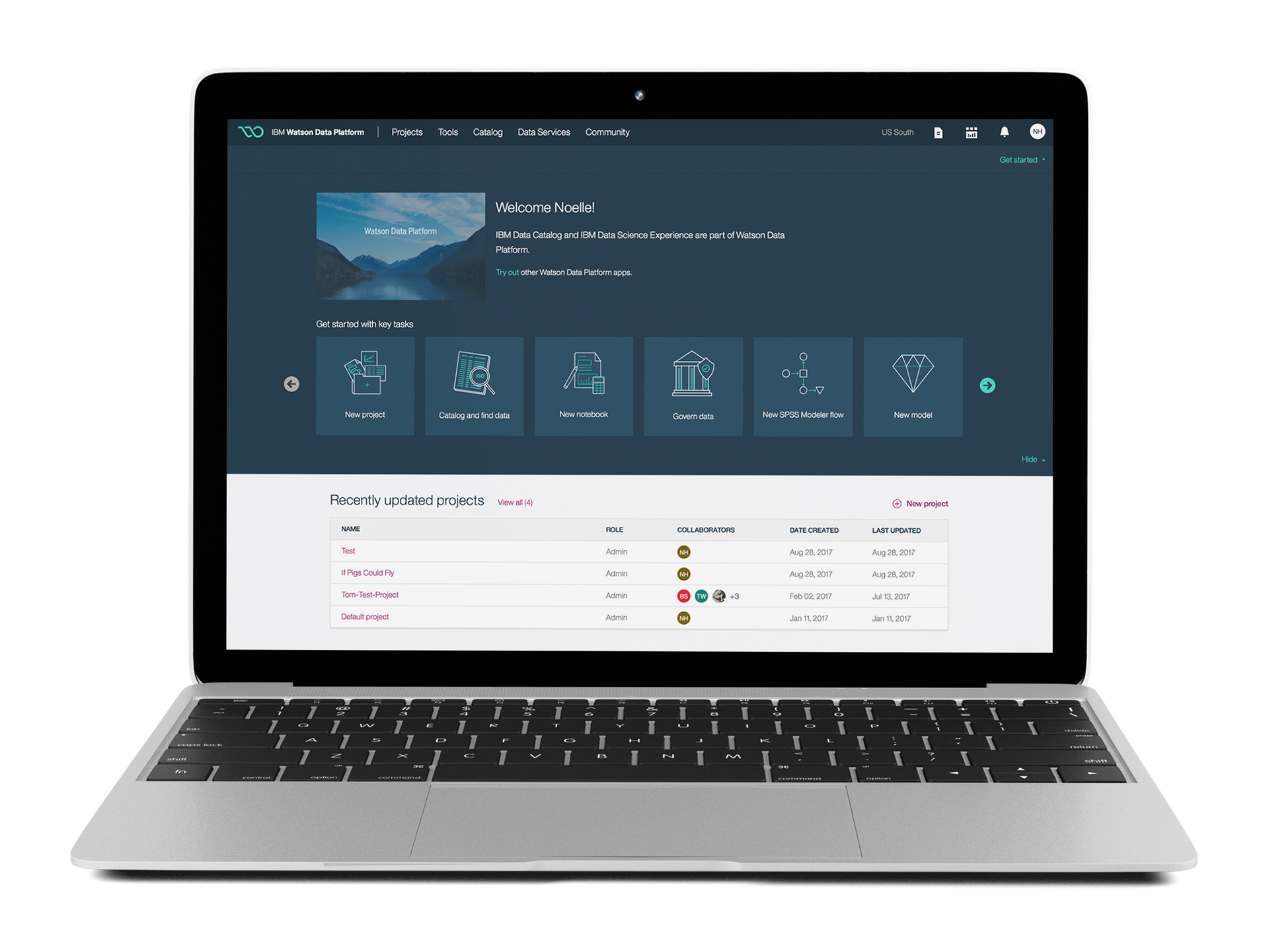
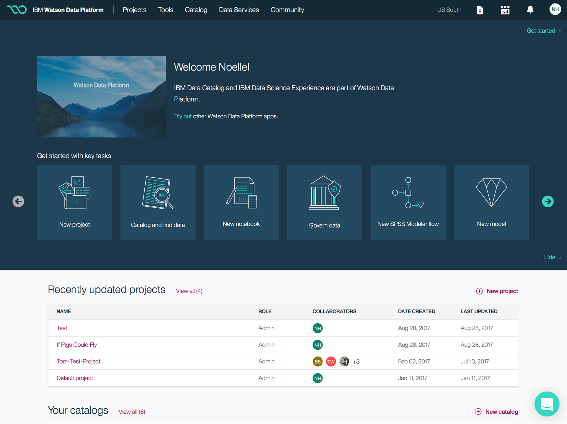
Home Page
When I joined the team in 2016 the portfolio had about 20+ products, each with a different user interface, which made it difficult for users to find what they were looking for.
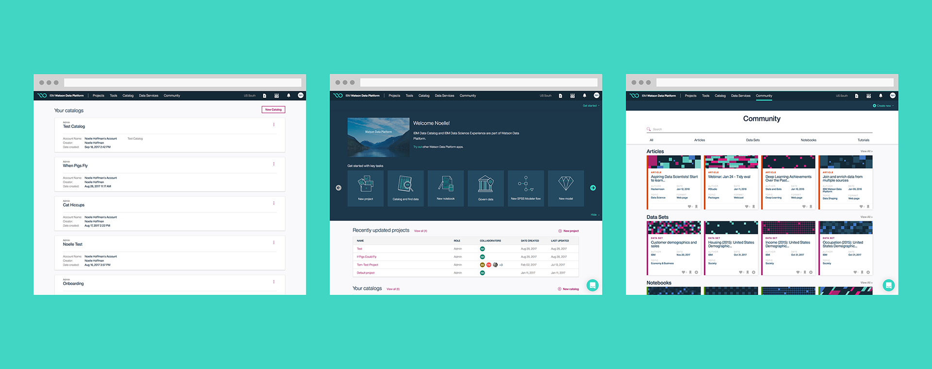
After some initial user testing, we quickly learned that the user needed a robust home page to monitor their projects, catalogs, and other tools. Our solution was to design four major experiences that unify the tools - Projects, Catalog, Community, and Data Services. The design of this page gave the user snapshots of their important information through a dashboard view.
Catalog
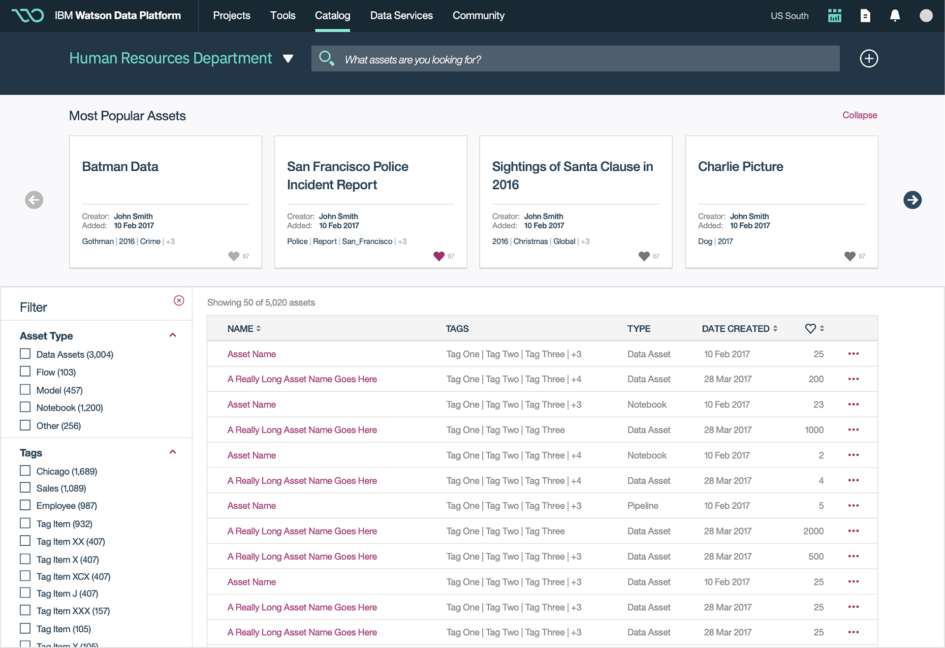
The Catalog serves as an inventory of available data that helps business analysts and other data users evaluate data health and intended uses.
We made finding the right data quickly with the addition of asset filters, tags, and other search tools. Another important feature to note on this page is the collapsable carousel showing most popular assets.
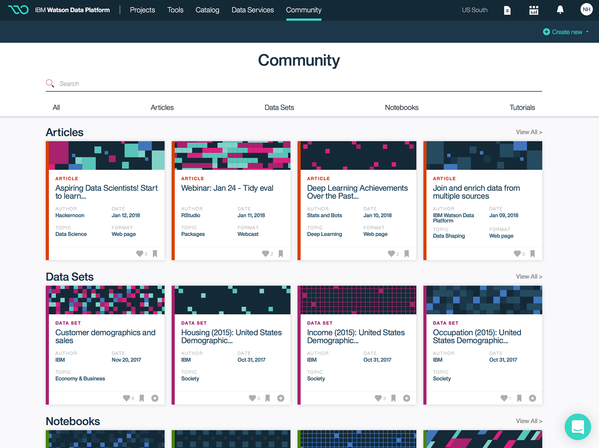
Community
The public community page is a valuable resource that showcases articles, data sets, notebooks, and tutorials posted by knowledgeable authors. We decided to use a simple card design for quick reference.
The cards became an important design element on this page. They needed to house a good amount of information without taking up too much real-estate.
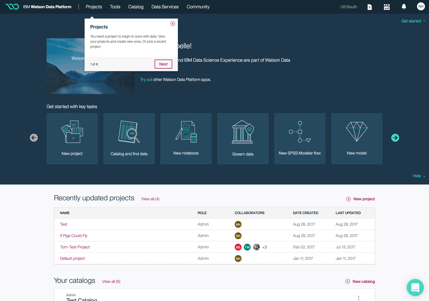
Tooltip Tour
How do we onboard the user without overwhelming them? I worked closely with our front end developer to come up with the best onboarding solution.
We started by doing in-depth research on tooltip integrations including programs like Hopscotch and Chameleon, but ultimately decided to create out own.
There are eight tooltips in total that explain everything in the navigation. The user can take the full tooltip tour or exit at any time.
Final Product